christina su
Building trust in fintech
role
External Product Designer
timeline
6 months
(Jun - Nov 2024)
team
2 Product Designers
1 UX Researcher
4 Engineers
2 Project Managers
skills
UX strategy
Interaction design
Research
overview
My goal was to design the missing piece of Mariner's platform: a simple and trustworthy investing feature that would finally close the loop between financial coaching and real-world investment action.

I was brought in an External Product Designer and collaborated closely with Mariner’s internal Principal Product Designer, UX Researcher, Product Manager and two engineers.
About Mariner Financial Wellness
Mariner Financial Wellness partners with companies to offer their employees personalized financial coaching, their platform has many tools for budgeting, goal-setting and financial education.
Problem
Users, stakeholders and their needs
Balancing the needs of Mariner’s users, clients and business was key to defining the project's success.
The business needed to evolve from just helping people manage their money to actually helping them grow it, all in one place.
research
Understanding the confidence gap
With the needs defined, my research focused on answering two questions:
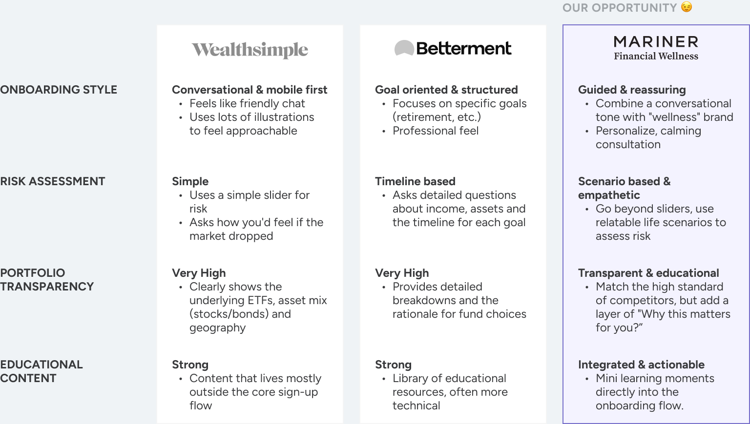
How are the top platforms solving this problem already?
What are the specific anxieties / goals of our users?
I began by analyzing leading robo-advisor and simplified investment platforms, Wealthsimple and Betterment.
Next, I turned inward to understand our users.

I looked at the data from user support tickets, feature request forums and with the help of Mariner’s UX Researcher, conducted five user interviews with current Mariner users who expressed interest in investing.
This revealed three main needs:
Clarity
To understand how their money is working for them in simple terms.
Control
To delegate stressful decisions but still feel in command of their financial future.
Tangible
To visualize their potential growth to feel confident enough to start.
From this research, I concluded...
Users weren't missing information, they were missing confidence.
This led to critical questions:
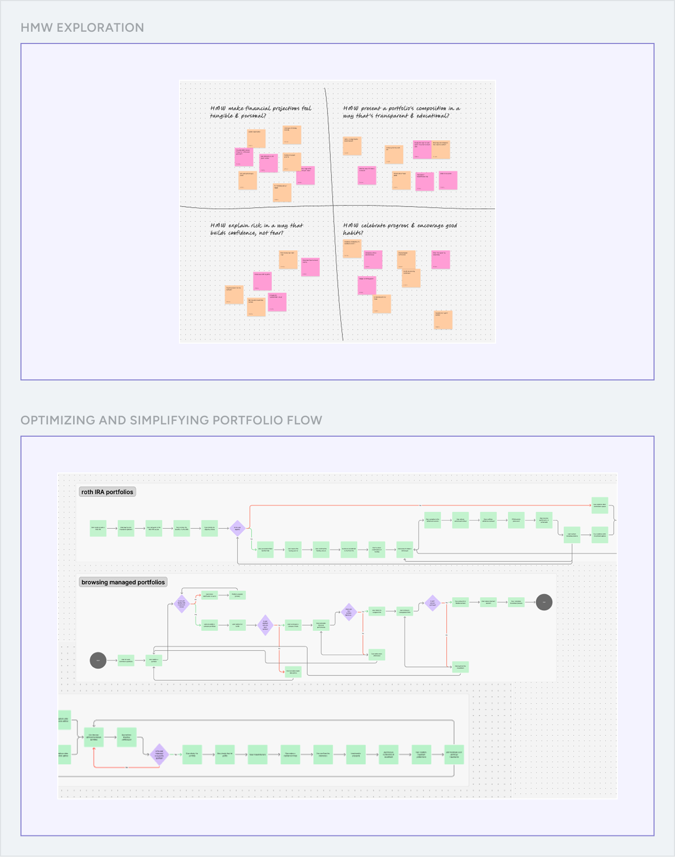
HMW make financial projections feel tangible and personal, inspiring action rather than anxiety?
HMW present a portfolio's composition in a way that feels transparent and educational, not overwhelming?
...which shaped the design solutions below.
Experimentation & ideation
From insight to interface
I kicked things off with a brainstorming session with Mariner’s Principal Product Designer to explore the possibilities. From there, I moved straight into mapping multiple user flows for browsing, comparing and selecting portfolios.
Visualizing the future
I designed an interactive projection tool presented early in the onboarding.

Users can model different financial scenarios by adjusting their contributions and timeline. This transforms an abstract goal into a tangible, data-driven visualization.
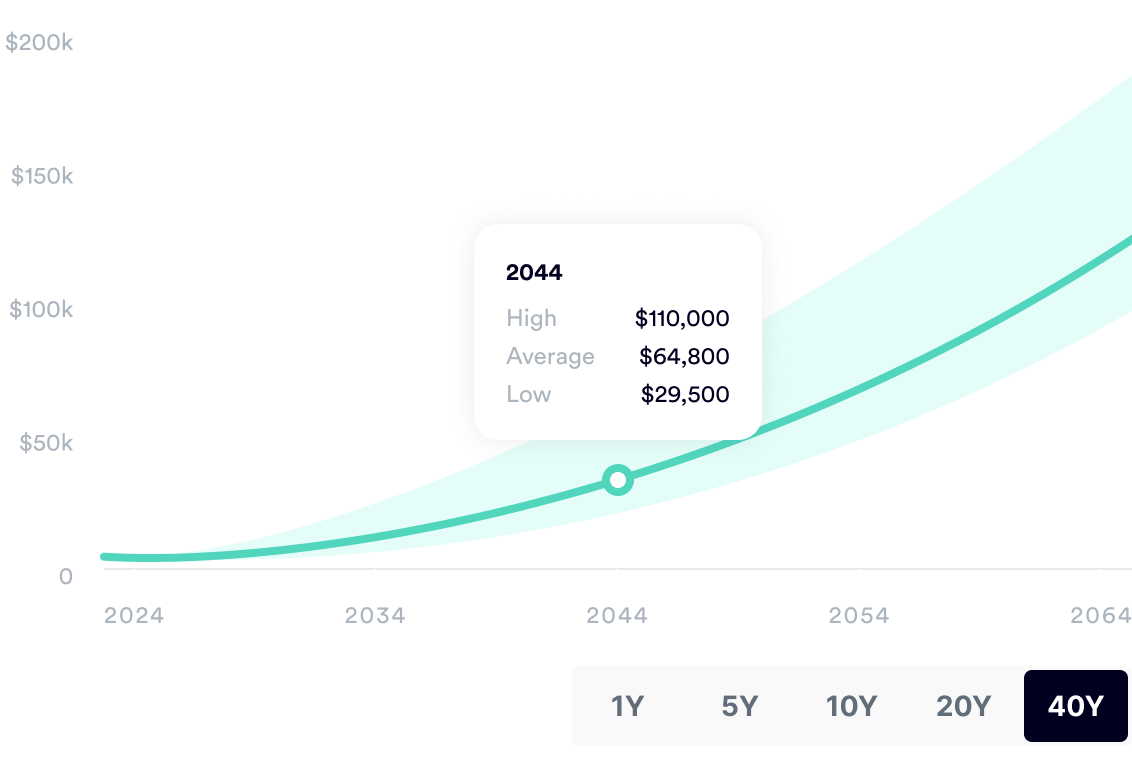
V1 - PROJECTION LINES
The goal was to be upfront about market volatility.

This approach backfired in usability testing. Users fixated on the worst-case (low) line, which hurt their motivation before they even started. Introducing the concept of loss
before they have grasped the potential of growth was a barrier to entry.
This finding meant halting development on V1. I had to successfully negotiate with Mariner's Head of Engineering and PM to allocate an extra sprint for a complete redesign, using the high drop off metrics to validate that proceeding with the existing build would have delivered a critical product failure.
V2 - POTENTIAL GROWTH CALCULATOR
🔬
I deployed V2 as a A/B test against V1's existing design.

The core hypothesis was: By simplifying the projection visualization to focus solely on potential positive growth (V2), we will reduce user anxiety in onboarding completion compared to the baseline V1 (volatility lines).
Impact
Trust through transparency
The recommendation screen was the single most important moment for building user trust. I started by reviewing the V1 wireframes from Mariner’s lead designer, which contained plenty of information to be as transparent as possible.
V1 - IS TOO MUCH CONTROL A BAD THING?
The original design was an "all-in-one" tool that gave users data and controls upfront.

The idea was that more information would be more empowering. But in testing, it had the opposite effect, users experienced decision paralysis.
V2 - USERS WANT UNDERSTAND WHAT THEY CAN CONTROL
I pivoted from a dashboard to a "prescription" model, a linear narrative that validates the user's needs (the why) before explaining the solution (the what).

This structure created a natural reading order that humans prefer (problem → solution), replacing the cognitive load of raw data. Crucially, leading with the "why" built trust by proving we listened to their inputs and positioned Mariner as a trusted advisor providing a curated solution, not just a tool provider.
Impact
We measured a 30% reduction in drop-offs on this screen, and users described the new version as "much more reassuring."
Empowering user choice
Even with a great recommendation by Mariner, some users still have that "what if...?" feeling.

To address this, I designed a side-by-side comparison tool. It lets users compare their recommended portfolio against other options, giving them the final say and the confidence to commit.
Impact
90% of users stuck with their original recommendation. The real value of the comparison tool wasn't to change their minds, it was to minimize doubt and prove that Mariner’s choice was the right one for them all along.
Design
After the iterations, to ensure the new investing features scaled seamlessly across the platform, I led a restructuring of Mariner’s existing UI library.
Design system
I moved the team away from hard coded values to a system using design tokens and Figma variables. By defining semantic aliases, I established a shared language between design and engineering. This reduced design debt, streamlined developer handoff and ensured that future updates could be deployed globally with a few clicks.

We are currently working on moving this design system to Storybook.
Prototype
Ta-da! Here is the final prototype. I'm showing the mobile version because a mobile-first design was also a key project goal (it also helps that clickable prototypes are easier to navigate in this format!)

To get you to the core experience faster, I’ve streamlined the flow to bypass the initial risk assessment steps, so you’ll land right on the final portfolio recommendation dashboard.

Go ahead and check it out :) ->
Additional work
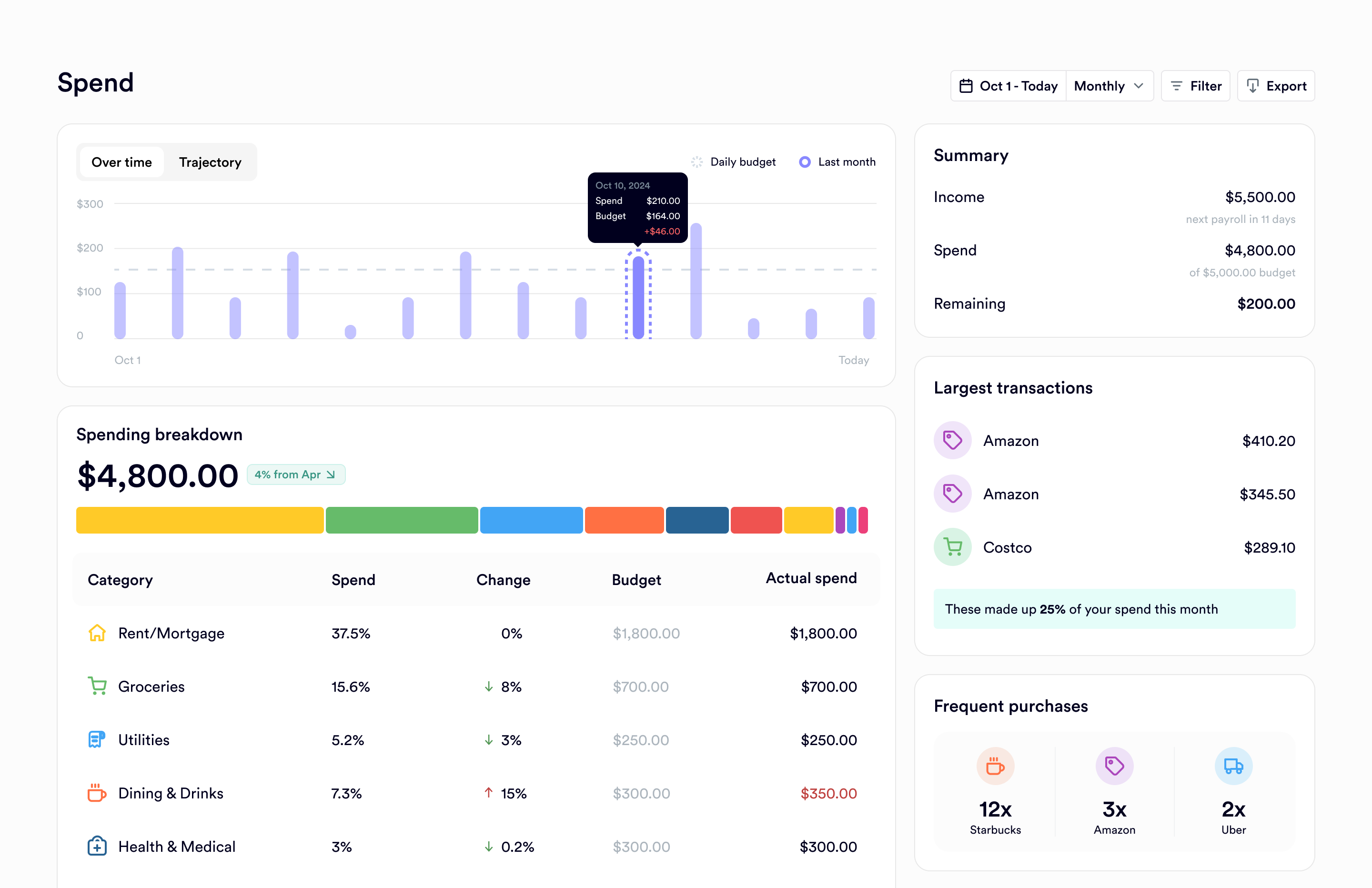
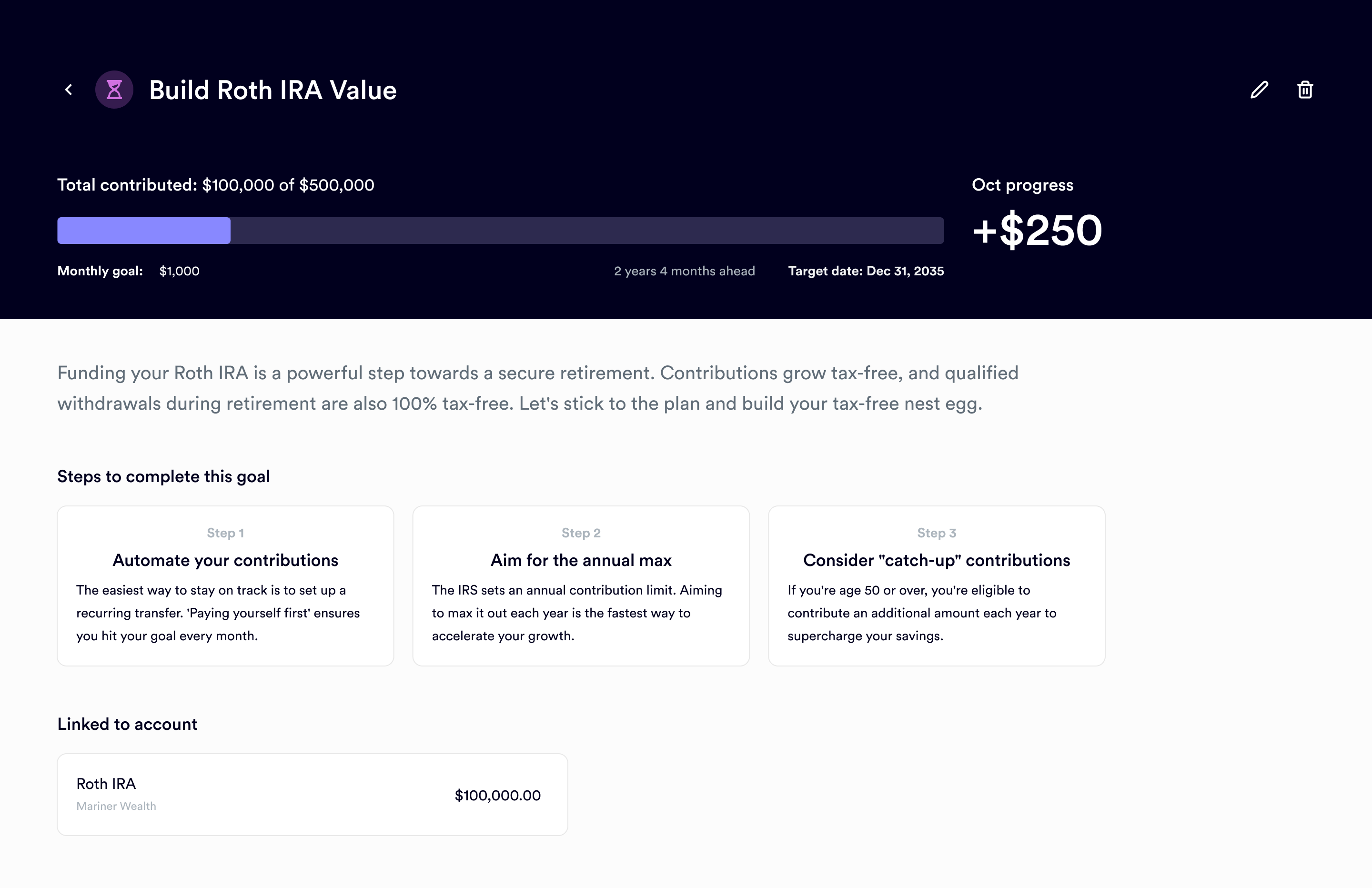
This case study focuses on the onboarding / portfolio flow, but that wasn't all I did. My work with Mariner actually covered the end-to-end platform experience. Here I present some of the other key areas I designed, like the main financial dashboard, budgeting tools, and goal setting pages.
Carousel image
Carousel image
Carousel image
Carousel image
conclusion
By focusing on building confidence through clarity, this project bridged the gap between saving and investing for Mariner's users, meeting all of our primary success metrics within the first quarter post-launch.
Takeaways
This project was a lesson in designing for trust in a highly regulated space. It reinforced the importance of translating complex financial data into simple, human centered stories.
My key takeaway was that for this type of user, clarity is the ultimate form of empowerment. They weren't looking for more data or more tools, they were looking for the confidence to make a single, simple decision.
Next steps
If I were to continue working on this project, the immediate next steps would be:
Integrate with the budget: The next big win would be to link these investment goals directly to the main budgeting tool, turning the contribution into a planned monthly "expense" and fully automating the user's path to saving.
Use test the labels: I'd push to test the portfolio names and risk levels. Labels like "Heritage" and "Income" aren't very intuitive for new investors. Even if the names are fixed, we could improve the experience by adding clearer, more benefit-focused descriptions.