christina su
From cold leads to warm handoffs
role
Product Designer
timeline
5 months
(Jan - May 2024)
team
2 Product Designers
3 Engineers
1 Project Manager
skills
UX strategy
Interaction design
Data visualization
Research
overview
My challenge was to design 360Lending's first digital application. Their existing contact form was failing to convert their 80% mobile audience, creating a bottleneck of unqualified leads.

I led the UX strategy and interaction design to build a mobile-first, conversational flow from the ground up.
About 360Lending
360Lending is a Canadian lender for complex mortgages (like HELOCs and refinancing). They needed a modern app to connect their mobile-first customers with their team of expert brokers.
challenge
The high cost, low conversion problem
360Lending's strength is providing high touch, personalized advice for complex financial products like HELOCs, second mortgages, and refinancing. However, their business model was misaligned with their user behaviour.

Despite 80% of their traffic coming from mobile, their digital "front door" was just a "Contact Us" form. This simple lead capture form forced every potential customer into the same high-friction bottleneck: scheduling a phone call with a broker.
Business problems
1. Leaky funnel
For a mobile first audience expecting a seamless digital experience, this manual step was a big point of friction, causing significant user drop off.
2. High operational cost
Brokers time was consumed by manually qualifying every lead that came through the form, whether they were a good fit or not.
Goal: Stop being a "lead-gen" website and become a true digital lender.
research
Finding our niche in a crowded digital market
The Canadian digital mortgage space is crowded, so I analyzed the application flows of 4 major companies: nesto, True North Mortgage, Nuborrow, and Rate.ca. My goal was to identify best practices,  pain points and opportunities for 360Lending.
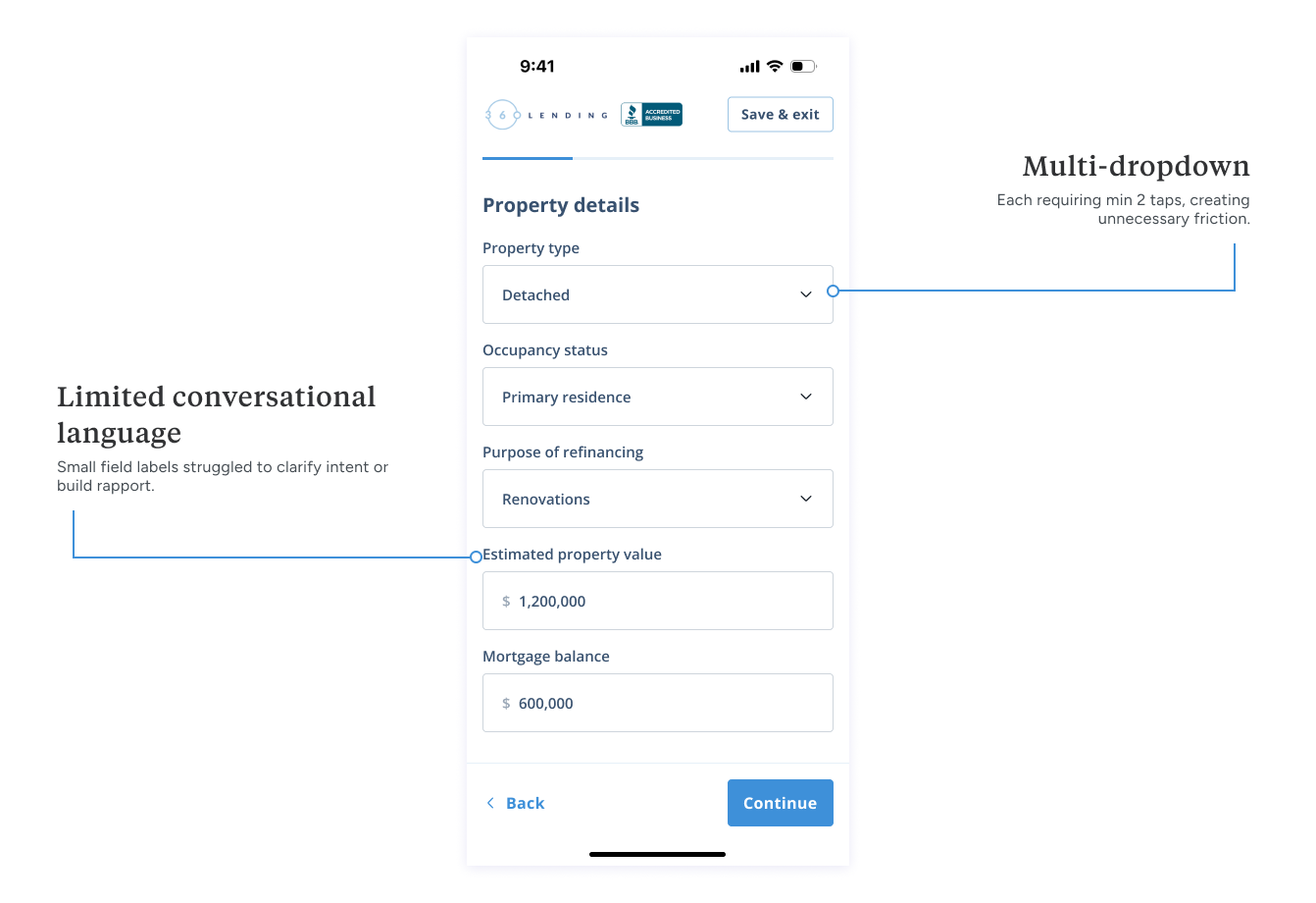
Competitors like nesto offer a 100% digital, self directed product. This is fast and efficient for tech-savvy users but can be cold and intimidating for those with complex financial situations.

True North and NuBorrow use digital forms as a more efficient "front-door" to a traditional brokerage service. The experience is better than a simple form but still primarily a tool for lead capture.
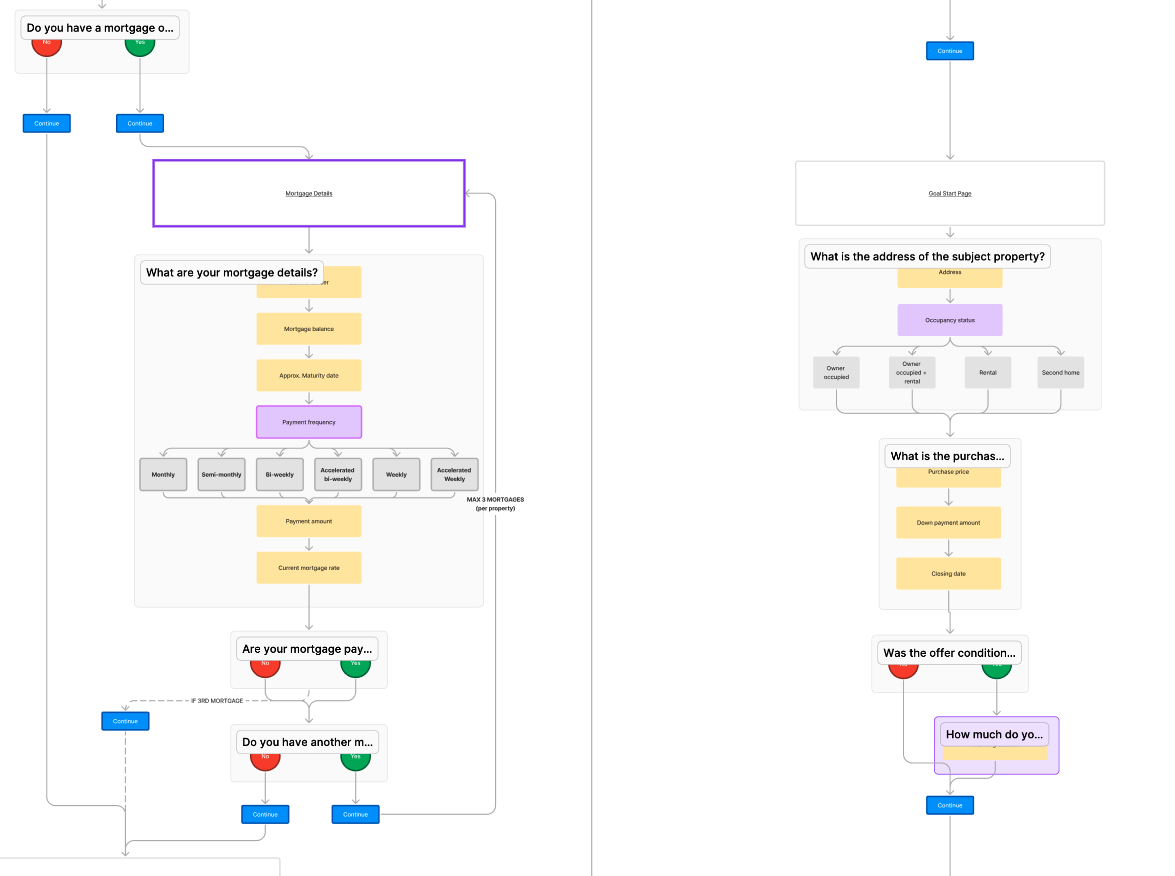
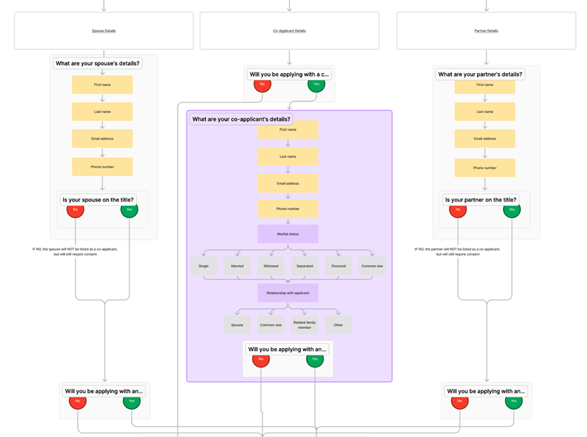
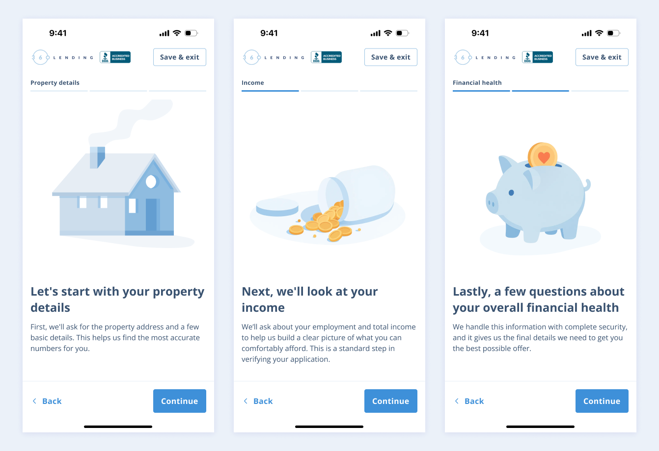
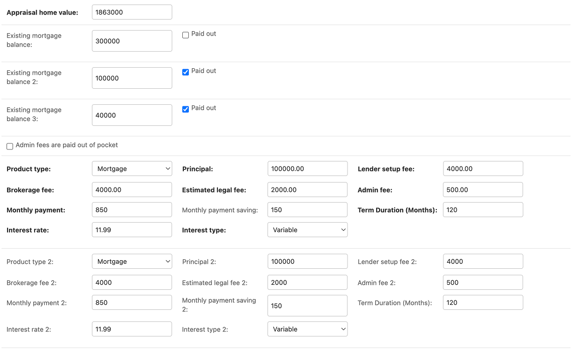
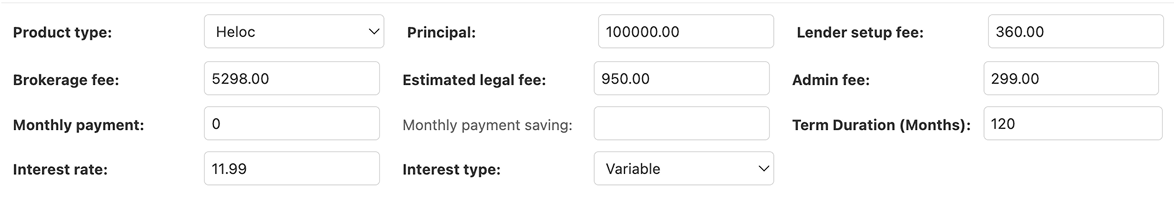
This research made me realize that we needed to design a "smart" application, not just a "fast" one. It needed to ask the right questions at the right time, so that by the time the user finished, they felt understood and the broker received a highly qualified, high context lead.
The broker’s perspective
The competitor analysis showed us what to build, my internal research told us why.

The UX Researcher and I conducted in-office, qualitative interviews with their over 20 mortgage brokers at 360Lending to map their existing process and understand their primary pain points.
We found three main challenges:
No qualification: Brokers wasted significant time on unqualified leads. The simple form couldn't differentiate between a user who was "just browsing" and one ready to apply.
Cold call context: For qualified leads, brokers went into every call blind. They had to spend the first 20 minutes manually re-asking basic questions that a digital form could have easily captured.
Data entry: The entire process was manual, slow, and prone to error. This created a frustrating, low trust experience for the customer, who had to provide sensitive information over the phone.
I had a clear understanding of the external market gap and the internal business bottleneck. It was time to design a solution that could bridge the two.
design process
One application, nine products
Before I could design a single screen, I had to map the flows.

360Lending has a collection of services like HELOCs, Second Mortgages, and Refinancing. Each path demands unique questions, data points and branching logic. My first task was to collaborate with the brokers and stakeholders to create a user flow diagram. This became our source of truth.
From complexity to conversation
My design process was guided by three key challenges, starting with the most critical one: the 80% mobile audience.
How might we build a mobile-first experience that feels like a conversation?
My initial wireframes explored grouping related fields onto single, scrolling, digestible mobile pages (ex. "Personal info," "Property details"). However, it still felt like a form. The team and I saw hesitation as users anticipated a long, tedious process. The mobile audience expects a fast, app-like experience, not a desktop form shrunk to a small screen.
V1 - GROUPED FIELDS
This version created friction with multi-click dropdowns. More importantly, lead data only saved on "Continue". This meant any user who dropped off lost all their entered data on that screen, a frustrating experience for them when they return and a data loss for the brokers.
V2 - GUIDED ONE TAP
I designed a "one-question, one-tap" conversational flow that feels app-native, not like a website.

To create a frictionless experience, I removed the "Next" button entirely for choice-based screens. The "Next" button only appears when manual input is required. This single decision saved a tap on almost every screen, turning a form into a seamless and efficient flow.

This approach creates a fast, seamless sense of momentum. It breaks complex financial queries into simple, digestible steps as a guided conversation, lowering cognitive load and building user confidence.
Impact
By launching the mobile-first flow, we saw a 40% lift in completed applications and captured 60% more partial lead data from drop-offs.
Power of the checkpoint
The one question, one tap flow was fast, but early testing revealed a new usability problem: "flow fatigue."

Because the user was so in the weeds answering one question at a time, there is a potential they lose sight of the bigger picture. The sectioned progress bar helped, but it was passive. Users would finish one section (like Property details) and flow directly into the next (ncome) without a moment to breathe.
How do we give the user a clear sense of accomplishment and prepare them for what's next?
I designed a simple full screen transition between each section.

These screens serves two functions:
Confirm accomplishment: Acts a checkpoint that celebrates progress. This provides a small dopamine hit and a clear sense of completion.
Set expectations: Transparently introduce the next section. This mental framing removes the surprise being asked new, unrelated questions.
This design allows for a guided journey with clear, manageable milestones, giving users the confidence and mental breathing room to continue.
Impact
The checkpoints addressed drop off risk and replaced user anxiety with clear expectations, acting as a critical tool to guide users through a financial application.
Personalized and transparent offer
The application experience doesn't end when the user hits submit. The most critical moment is when they receive their offer.

Previously, brokers used a backend system to input data, which then generated dense PDF for the borrower. Users got a final number but couldn't easily understand how it was calculated or why it was a good deal.

My challenge was to take this raw, complex backend data and translate it into a transparent, reassuring digital experience.
How might we make complex terms feel like plain English?
Raw financial data is cold and confusing. A user shouldn't have to do mental math to understand their own offer. I needed a way to translate rigid database fields into a human narrative.

I worked with their brokers and our dev team to build a dynamic sentence mapping system. Instead of static templates, we created a dynamic system where backend input (like loan terms, interest rates, and even specific conditional fees) outputs more digestible sentences.
final design
I prioritized a guided, conversational and mobile-first interface.
The solution is a one question, one tap flow that replaces the high friction contact form. This offers a familiar, app like experience designed to finally capture the 80% mobile audience by building user trust and momentum.
A personalized, transparent offer
The application is just the first step. Another goal was to provide the user with a understandable and personalized offer after they've spoken with a broker.

In addition to the application flow, I designed a "Offer Summary" that consolidates all the complex financial data into a single, easy to digest dashboard that is, of course, mobile-friendly.
This second mortgage offer tells a story to the borrower: we first show the offer (loan amount), then the so what? (annual savings), the details (where the money goes) and finally the context (their home equity).

Due to time constraints, we implemented the Sankey diagram on mobile. Not ideal, but more on this in Conclusion.
conclusion
This project successfully transformed 360Lending's digital front door from a high-friction form to an empathetic, mobile-first application. I created a system that delivers high context, qualified leads, finally capturing the 80% mobile audience and turning cold leads into warm, efficient broker handoffs!
Lessons & next steps
A key challenge was balancing a fast dev timeline with an ideal user experience. This led to a limitation I'm looking to iterate on in the future: the Sankey diagram on the mobile offer dashboard.
While a powerful data visual on desktop, we launched with it on mobile to meet scope and time constraints. Its readability on a small screen is not ideal. My immediate next step would be to A/B test a mobile specific component to replace it, likely an interactive donut chart or a stacked bar, to ensure the fund breakdown is as clear and intuitive as the rest of the mobile-first experience.